Inventório: Design Influences on Science Picture Books for Children
Ana Paula Campos
As a graphic designer from São Paulo, Brazil, I did a four-year Master’s programme on design and scientific dissemination for children. It was only in the final stages of this process that I came across informational books and found that there were practically no theoretical texts in Portuguese on the subject.
I believe that at the time, in late 2014, only me and four or five other people were studying this in Brazil . . . and perhaps the situation is not too different today. There is still much to do and I hope that this article can contribute toward a deeper and wider-reaching understanding of informational picture books, thus I am available to continue the conversation beyond this text.
I keep on with my research independently, and after some years, it has become clear that fiction and non-fiction picture books share expressive verbal–visual language resources, with some specificities in the case of non-fiction. And I believe that these specificities may be better understood with the support of information design theory, which is intrinsically interdisciplinary. And this is why the works of Professor Sue Walker helped me greatly in my Master’s studies.
I will present here the categories of analysis that I used to undertake a global reading of informational books with the book Lá fora: Guia para descobrir a natureza (Outside: A Guide to Discovering Nature), from 2014, from Portuguese publisher Planeta Tangerina, as a case study.
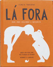
This book was selected because of its characteristic functioning, which responds to questions very typical of our times: it arose out of a process of collaborative and participatory creation and has fundamental playful aspects and arduous information design and visualisation work.
According to Walker, to characterise information books, we may take into account contextual factors (the context of the creative process and its influence on design decisions) and intrinsic factors (characteristics inherent to the book’s content). Let’s begin by discussing some of the contextual factors of Outside.
What is referred to as PRODUCTION are the processes, agents and technology involved in the production of the book. The publisher Planeta Tangerina holds many workshops to maintain contact with children and, in this way, gathers ideas for its projects and promotes the release of its products. In this book, the creators began with children’s initial questions in order to ensure that their curiosities would be covered. As a team, their process was considerably participatory, with all providing their opinion during the conception phase.
The team was one made up mainly of image professionals: six designers and illustrators (who in some cases were the authors of some of the texts as well) and a writer. As a design publisher, Planeta Tangerina has the freedom to produce and publish books in accordance with what is most interesting or challenging, always basing itself on themes proposed by internal staff members, who conceptualise the book as a whole.
The category MEDIUM refers to the physical characteristics of the material. The book is reminiscent of a natural sciences textbook, an encyclopaedia, or a field notebook containing the annotations of a naturalist. It features a large number of pages (368 all told), a hard cover and woven binding, which makes it easy to open and comfortable to read, but it is slightly heavy for small hands and not very practical if you actually want to take it with you on a nature outing. Apart from this, as we shall see, it has many of the qualities of a quality informational book, as can be attested to by the fact that it has won many awards and been translated into more than seven languages.
The category USAGE refers to the needs of the user and the circumstances in which the book is used. Outside seems to have been planned with individual reading in mind, given the size of the font in the different levels of hierarchy of the texts, which were probably intended for an audience that already has a certain mastery of reading. Even so, it contains may opportunities for joint reading among adults, young people and children as a result of the spreads organised in a very diagram-like way, and the support of local and global tools to facilitate the reading process.
An example of this crossover characteristic is the book’s paratext. In the presentation text on the back cover, we notice three subtly distinct ways of addressing readers, with different typographical treatments (bold, regular and different-sized letters) and different contents and stances with regards to the reader. The final passage seems to be directed at those who have bothered to read the text through to the end, for it brings more information on the book – possibly for an adult deciding whether or not to purchase it.
On another hand, there are the intrinsic factors that highlight a few important ideas for the understanding of informational books.
In the category of CONTENT are the components of the information to be communicated. Outside is organised in parts: introduction, scientific contents divided into chapters and additional content (a glossary, an environmental timeline and a list of online sources for new searches).
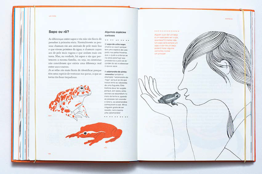
In this sense, foci is an important aspect of conveying information. Outside transmits an entertaining and accessible vision of scientists’ work through the way the information is transmitted by words and images. This illustration shows the method for the collection and analysis of biological traces, which may be regarded as a ‘follow the trail’ game.
Illustrating ‘Content’
In this illustration, rational thought takes the place of magical thought to explain that it is rather ill-advised to go around kissing frogs. The image is read first, as a result of an intrinsic characteristic of pictorial language, and because here it is considerably larger than the text, as well as being very attractive and recognisable. Because it is simple, it allows the reader’s gaze to flow across to the text, which surprises us with an explanation that refers to the fable in an ironic way:
Does anyone want to kiss a frog to see what happens? It’s better not to. A frog will always be a frog, and giving it a kiss could bring you an itch, but never a prince!
This is a counterpoint relationship, in which the image has the function of evoking or persuading, while the text has that of informing. This relationship between opposites – the thinking of fables versus that of science – enriches the informational book’s discourse in accommodating different visions of the world, with their discourses in constant construction and confrontation.
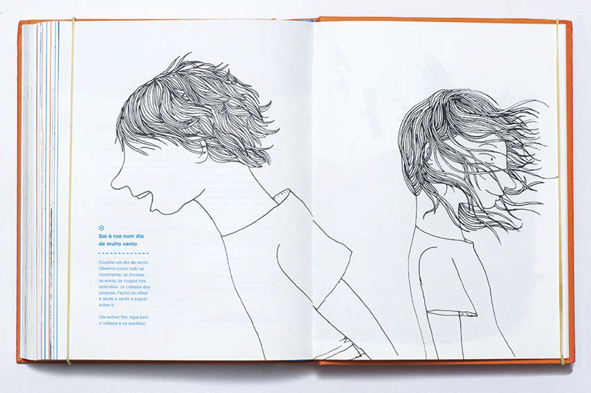
Outside’s words and images suggest an implicit child reader, represented by the characters of the girl and the boy, shown as autonomous, in a free and active deportment.
Illustrating ‘Content’
The illustrator Bernardo Carvalho tells of the role these images perform in the construction of the book’s messages:
For me, this is truly very important, trying to get people to think that this book is also about them. . . . Tons of kids have come to me asking: ‘that’s me, isn’t it?’
LINGUISTICS refers to the language structures that make up the elements of the layout. The different types of relationship between texts and images arise as a result of different combinations of the elements that make up the modes of graphic language: verbal mode (words and numbers), pictorial mode (figurative images) and schematic mode (abstract forms). The combinations between the modes and elements of graphic language arise according to ‘methods of configuration’, which are the forms in which information is organised. As such, these forms may be linear (pure, interrupted or ramified), in list form, in a matrix or non-linear.
The category RHETORIC refers to the rhetorical relationships between the elements of the content – words, images and schematic elements – and how they are argued in order to build meanings. In Outside there is a prevalence of open texts, with the use of many questions and dialogues with an informational, evocative and propositional function. With regards to the images, we find a predominance of the relationship of redundancy and amplification of the verbal texts: the contents represented in the two modes refer to the same ideas, but communicate different aspects – one may say more than the other without contradicting or repeating it.
NAVIGATION refers to the ways in which the usage planned for the document is conducted. In the words of editor Isabel Minhós Martin:
This is really what reading an album is: reading not just words, but images as well; reading not just pages, but sequences. Reading covers, endsheets, rhythms and changes in rhythm, reading scenes, views, details, different types of representation, constantly making linkages between the elements, taking pleasure in the movement, noise, pauses and silence of the pages.
Illustrating ‘Navigation’
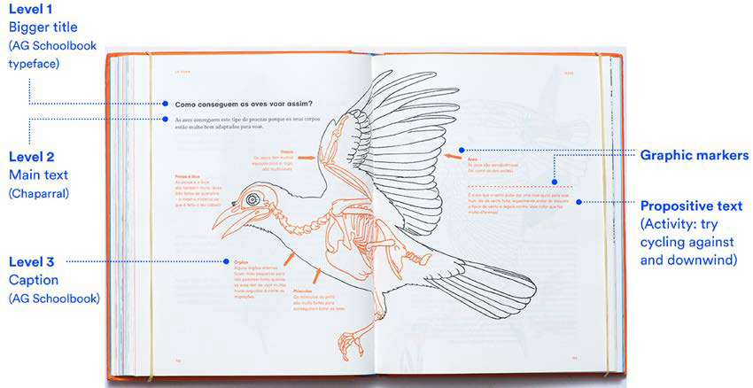
We find the use of local and global tools cited by Walker as ways of structuring content. In the case of Outside, the structuring is well defined on the global level and looser on the local level. The formatting of the spreads is rather varied, seeking a rhythm with few repetitions. On the level of global tools, we have the division by chapters, the consistent use of colour and the different design techniques to demarcate the transition from one type of content to another. Whereas, on the local level, the tools used to assist in the navigation and identification of the different contents are mainly typographic and may also include schematic elements like lines, arrows, asterisks, bullets and frames.
The organisation of the themes presents a high level of coherence in relation to the spreads, which configure thematic units in which the images dialogue with the main text, establishing a relationship of mutual construction of information.
And finally LAYOUT, which refers to the nature, appearance and position of the communicational elements on the pages. In the book, the levels of information go side by side with the main text, which brings the elementary information of each chapter. The levels of reading of the verbal and pictorial texts are varied: main text, image legends, activities, proposals for activities, boards for comparing species, descriptive illustrations, infographics, watercolours, chapter openings and monochromatic boards.
Two different types of illustration are present in the book. Evocative illustrations recall for images without any direct reference in the main verbal text and that may appear with or without a legend. Their primordial function is not to present data or illustrate precise information from the text, but rather to provide breathing pauses while reading.
On the other hand, informative illustrations represent the elements touched upon in the verbal texts with simple and ‘naturalistic’ forms through operations of representation, comparison, visualisation of processes and spatial descriptions. They make it easier to understand and compare ideas, which is a fundamental support in the case of information being introduced to children.
Another aspect is scale: how can relationships of size be shown in a way that is not merely factual, such as the use of a ruler? This can be noticed in the many diagrams shown in the book. Diagrams are units of verbal–visual information arranged on the spreads in a more complex way than simple texts with isolated illustrations. This complexity depends on the types of relationship between text and image, on how close or far the legends are, on the volume of information and, if the images present the information in a synoptic manner (with only one image), or in a composite made up of different elements (that explain a phenomenon or process in two or more steps).
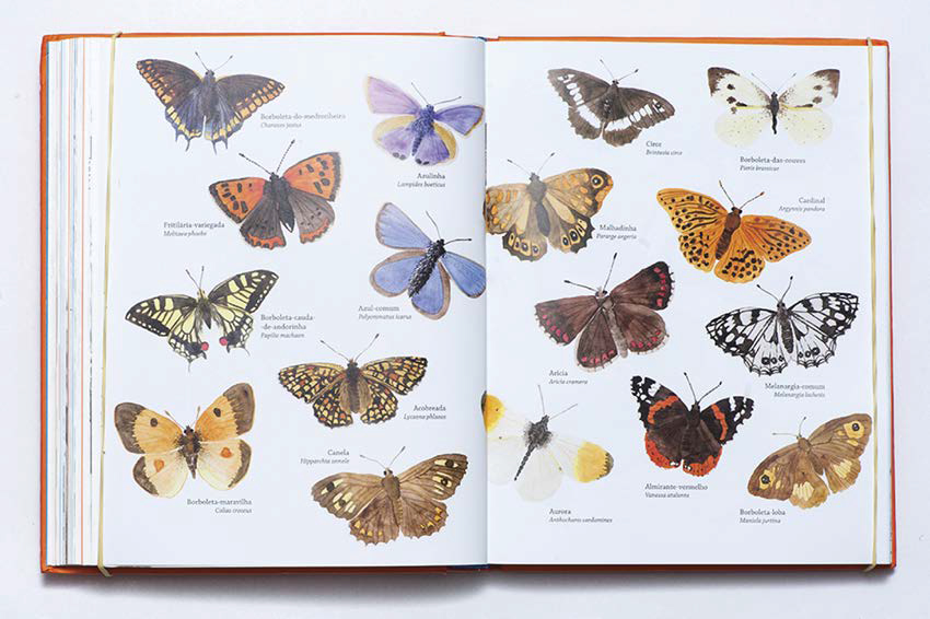
Illustrating ‘Informative’
In this sense, infographics in Outside appear in spreads with complex diagrams dedicated to explaining a single theme. The objective of the infographic images is to visually describe and provide additional support to what is said in the text.
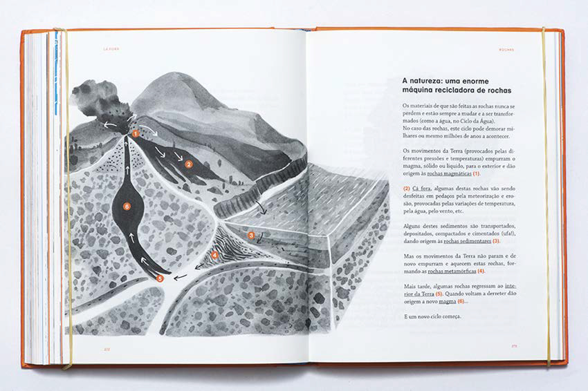
Illustrating ‘Infographics’
In conclusion, the categories of analysis brought up by my research support a global reading on children’s non-fiction books, taking into consideration the role of design in the conception of these works. In general, it may be noted that the more wide-reaching and initial the presence of design-oriented thought is in the elaboration of the book, the more the final product will be able to benefit in terms of artistic quality and content. The designer is a facilitator between content and the reading public, an intermediary and translator of complex ideas, thus serving the cause of the democratisation of the construction of knowledge and the circulation of information.
Acknowledgements
Léo Ramos Chaves (photographer)/Ana Paula Campos (rights owner), Bernardo P. Carvalho (illustrator). Planeta Tangerina (publisher). All these owners have granted permission for the reproduction of the images.
Works cited
Primary Work
Dias, Maria A.P., Inês T. do Rosário (illus. Bernardo Carvalho) (2014) Lá fora: Guia para descobrir a natureza. Lisboa: Planeta Tangerina.
Secondary Works
Garralón, Ana (2015) Ler e Saber: Livros Informativos para Crianças. São Paulo: Pulo do Gato.
Jacobson, Robert (1999) Information Design. Cambridge, MA: MIT Press.
Linden, Sophie V. der (2011) Para Ler o Livro Ilustrado. São Paulo: Coisac Naify.
Merveldt, Nikola von (2018) Informational Picturebooks. In B. Kümmerling- Meibauer (ed.), The Routledge Companion to Picturebooks (pp. 231–245). Oxford and New York: Routledge.
Niemeyer, Lucy (2010) Elementos de Semiótica Aplicados ao Design. Rio de Janeiro: 2AB.
Pettersson, Rune (2013) Information Design: Message Design. Vienna: International Institute for Information Design.
Walker, Sue (2012) Describing the Design of Children’s Books: An Analytical Approach. Visible Language Journal 46(3).
Ana Paula Campos lives and works in São Paulo, Brazil. She is a graphic designer and since 2015 has run a creative studio with a partner, where they work mostly for projects aimed at children and their carers in the fields of education, literature, culture and science. Before that, she worked as an information designer for the science magazine Pesquisa Fapesp from 2011 to 2019. In 2016, she obtained a Master’s degree from the University of São Paulo with research about the design of non-fiction picture books for children and young people. Since then, she has been studying, writing and teaching about the relationship between infographics, text, design and illustration in children’s non-fiction picture books.
